LearnDash 4.23.0 includes a neat addition to focus mode: presenter mode. I’ve implemented similar on a handful of learning platforms that were geared towards in-person group training sessions, so this feels like a no-brainer and a relatively low-effort feature.
Enabling Presenter Mode
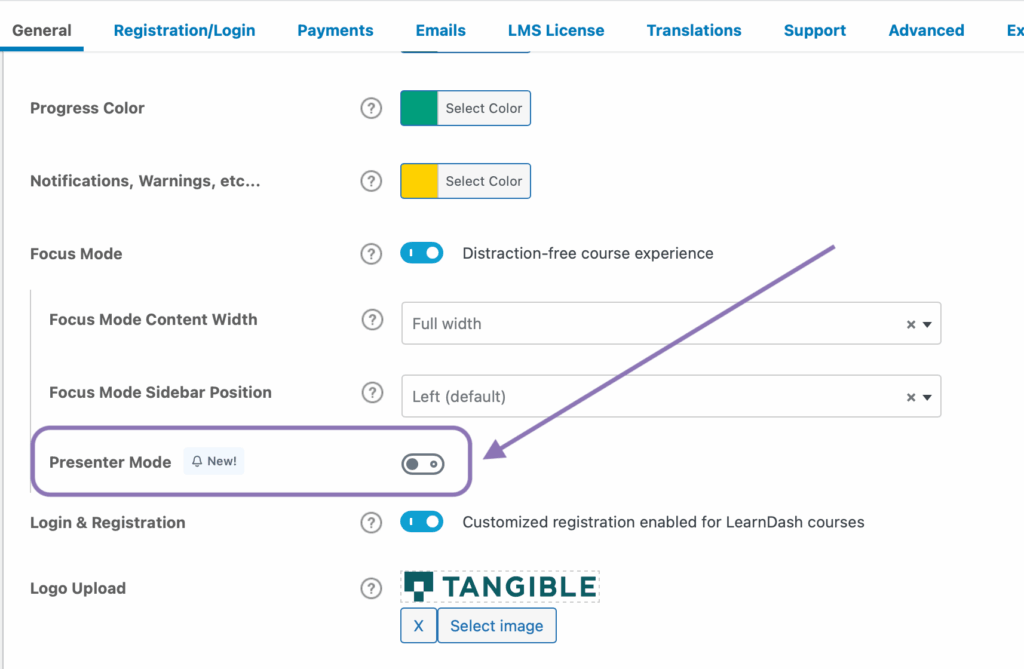
To enable the new feature, navigate to LearnDash LMS > Settings and find the grouping of options related to focus mode in the General tab.
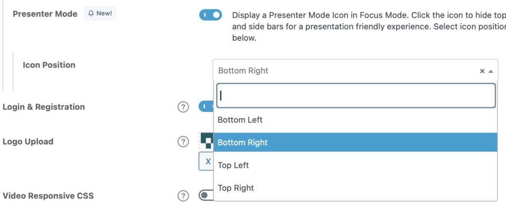
Once enabled, you’ll have the option of where the icon is placed in the focus mode UI
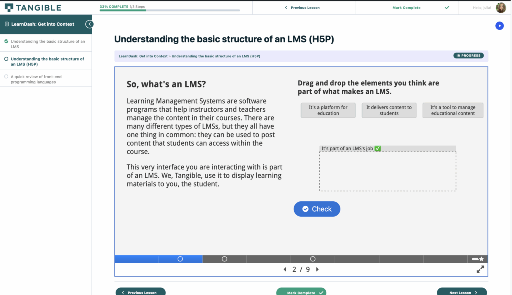
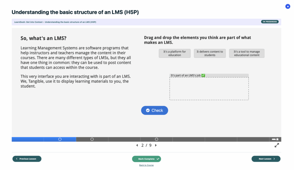
And it’s more interesting to watch a video or try it out yourself, but here’s what focus mode looks like with presenter mode disabled, then enabled:
Before getting into the weeds, I’d like to mention that LD has done a decent job of using best practices for accessibility here: such as using visually hidden labels for screen readers to indicate state, and creating beautiful, compliant focus states. It’s solid work, and I’m very happy to see them put a stronger emphasis on A11y lately.
Into the weeds!
A slightly problematic loading animation
In playing around with the feature today (the day of release) I’ve found that sometimes, when the scripts needed to run the feature fail to load or load slowly, it causes all focus mode content to be stuck set to opacity: 0;. I’m not really sure what the LD team were thinking adding a page load animation triggered by a “loaded” class being added to the DOM, especially given how slowly these sorts of sites load when they’re feature-heavy or stretching the limits of their server resources 😅
Here’s the offending area of presenter-mode.css, right at the end of it:
.ld-presenter-mode__body .ld-focus-header, .ld-presenter-mode__body .ld-focus-sidebar, .ld-presenter-mode__body .ld-presenter-mode {
    opacity: 0;
    transition:opacity .3s ease
}

.ld-presenter-mode__body .ld-focus-content {
    opacity: 0;
    transition:width .3s ease, opacity .3s ease
}

.ld-presenter-mode__body--loaded .ld-focus-content, .ld-presenter-mode__body--loaded .ld-focus-header, .ld-presenter-mode__body--loaded .ld-focus-sidebar, .ld-presenter-mode__body--loaded .ld-presenter-mode {
    opacity:1
}
If you’re having trouble with it, it would be pretty easy to override with a bit of CSS, but I question the wisdom of tucking this into an unrelated feature, and this method of load animation altogether (what if a user has JS disabled?!).
Decently well-written styles
The stylesheet declares a few CSS variables you could play with to customize some aspects of presenter mode positioning:
.ld-presenter-mode {
    --position-vertical: var(--ld-spacer-2);
    --position-horizontal: var(--ld-spacer-fixed-2);
    --focus-mode-header-height: 51px;
    --focus-mode-sidebar-width: 350px;
    --focus-mode-sidebar-collapsed-width: 50px;
    --focus-mode-content-top-margin: 30px;
    --focus-mode-content-z-index: 99;
}

@media (min-width: 720px) {
    .ld-presenter-mode {
        --position-vertical: var(--ld-spacer-5);
        --position-horizontal:var(--ld-spacer-fixed-5)
    }
}
These could come in pretty handy if you’ve already customized aspects of focus mode like the sidebar width in expanded or collapsed state or the header height, since you’ll only have to override these variables instead of modifying every line related to positioning in the feature’s stylesheet. You could also override --position-vertical and --position-horizontal to customize the presenter mode trigger placement relative to the edge of the screen if you don’t like where it lands.
The new floating button for triggering presenter mode doesn’t seem to respect the chosen accent color in LearnDash’s settings (yet?), so here’s a snippet to assist you in your styling adventures:
/* Mirroring LD's selectors to target all button modes for base styles */
:root .ld-presenter-mode__button,
:root .ld-presenter-mode__button:active,
:root .ld-presenter-mode__button:focus,
:root .ld-presenter-mode__button:focus-within,
:root .ld-presenter-mode__button:hover {
    background: #235af3;
    border: 2px solid #fff;
    color: #fff;
    font-family: "Roboto", sans-serif;
    font-size: 16px;
    font-weight: bold;
}
/* Customize any of the above properties on hover, or just the background colour */
:root .ld-presenter-mode__button:hover,
:root .ld-presenter-mode__button:focus:hover {
    background-color: #0e2a90;
}
Finally, for the true CSS nerds among you (or anyone thinking of customizing active presenter mode) here are, annotated, all of the styles applied when the ld-presenter-mode--active class is present on the ld-presenter-mode wrapper added by the feature just inside div.ld-focus-main.
/* Sets some CSS variables on ld-focus-content, removes max width to allow content to stretch to fill the screen */
.ld-presenter-mode--active + .ld-focus-content {
    --focus-mode-main-left-margin: 50px;
    --focus-mode-sidebar-open-main-left-margin: 350px;
    max-width:none !important
}

@media only screen and (min-width: 769px) {
  /* Adds left margin of -50px to the left side of ld-focus-content, to offset the space the sidebar normally takes up on non-mobile devices */
    .ld-presenter-mode--active + .ld-focus-content {
        margin:0 0 0 calc(var(--focus-mode-main-left-margin) * -1) !important
    }

  /* When the focus mode sidebar is open, -350px left margin is applied to the content on non-mobile devices */
    .ld-presenter-mode--active.ld-presenter-mode--focus-mode-sidebar-opened + .ld-focus-content {
        margin:0 0 0 calc(var(--focus-mode-sidebar-open-main-left-margin) * -1) !important
    }

  /* Overrides for the latter behaviors when the sidebar is positioned on the right side */
    .ld-presenter-mode--active.ld-presenter-mode--focus-mode-sidebar-position-right + .ld-focus-content {
        margin:0 calc(var(--focus-mode-main-left-margin) * -1) 0 0 !important
    }
    .ld-presenter-mode--active.ld-presenter-mode--focus-mode-sidebar-position-right.ld-presenter-mode--focus-mode-sidebar-opened + .ld-focus-content {
        margin:0 calc(var(--focus-mode-sidebar-open-main-left-margin) * -1) 0 0 !important
    }
}
I bet we can come up with some creative ways to mod this!

Responses