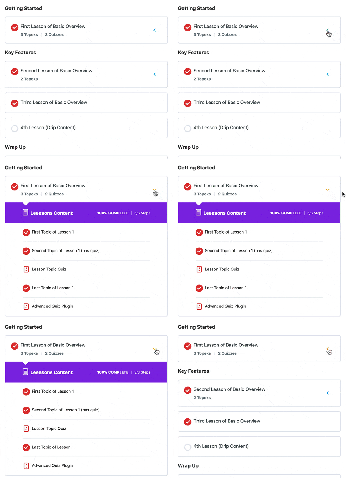
This group of CSS snippets will focus on customizing various things about the LearnDash course content expand/collapse functionality. There are quite a few different ways we can customize this, and I’ll walk you through several options.

Remove the “Expand” text next to the arrows
By default, the LearnDash course content list—displayed automatically at the bottom of course pages—shows the word “Expand” next to the arrow that opens & closes a lesson (to display the topics beneath it). We can remove this word to leave only the arrow.
.ld-item-list-items .ld-expand-button .ld-text {
	display: none;
}
We then need to add a little spacing to the arrow so it doesn’t hit the edge of the container. We do that with a margin-right on the arrow itself.
.learndash-wrapper .ld-expand-button.ld-button-alternate .ld-icon {
	margin-right: 15px;
}
Remove the colored circle background on the arrow
This will leave just the arrow, and remove the circle behind it.
.learndash-wrapper .ld-expand-button.ld-button-alternate .ld-icon {
	background: 0;
	color: #00a2e8;
}
.learndash-wrapper .ld-expand-button.ld-button-alternate:hover .ld-icon {
	background: 0;
}
In the first piece of CSS, you can change the color value to whatever color you’d like your arrows.
The second piece of CSS is to ensure the circle doesn’t appear again on hover.
Arrow hover & open color
If you want to change the arrow color on hover, and when the corresponding section is open/expanded, you can use this CSS:
.learndash-wrapper .ld-expand-button.ld-button-alternate:hover .ld-icon {
	color: orange;
}
.learndash-wrapper .ld-expand-button.ld-button-alternate.ld-expanded .ld-icon {
	color: orange;
}
Change the word orange to any hexadecimal or other color value you’d like.
Rotate the arrow
I think the default orientation of the arrow works well—up when closed, down when open. But you might want to have an arrow pointing sideways when closed, and down when open. We can add some CSS to rotate the arrow.
.learndash-wrapper .ld-expand-button.ld-button-alternate .ld-icon {
	transform: rotate(90deg);
}
.learndash-wrapper .ld-expand-button.ld-button-alternate.ld-expanded .ld-icon {
	transform: rotate(0deg);
}
This example will rotate the arrow to the left when closed, and down when open. Change 90deg to 270deg if you want the arrow pointing to the right.
Complete Code
It’s best to consolidate CSS code whenever possible. I’ve put it all together in its most consolidated form here. Feel free to delete specific lines that you don’t want to use, or adjust values to get your desired outcome.
.ld-item-list-items .ld-expand-button .ld-text {
	display: none;
}
.learndash-wrapper .ld-expand-button.ld-button-alternate .ld-icon {
	margin-right: 15px;
	background: 0;
	color: #00a2e8;
	transform: rotate(270deg);
}
.learndash-wrapper .ld-expand-button.ld-button-alternate:hover .ld-icon {
	background: 0;
	color: orange;
}
.learndash-wrapper .ld-expand-button.ld-button-alternate.ld-expanded .ld-icon {
	transform: rotate(0deg);
	color: orange;
}
